magicbus campaigns
- deliverable:
- web application feature
- role:
- product designer and front-end developer
- methods:
- rapid wireframing and prototyping. competitive analysis. copywriting. engineering. usability testing. marketing.
- artifacts:
- MagicBus
Problem
MagicBus is a commuting company that helps save people time and effort in their daily commute. While the MagicBus service is great, it isn't ubiquitous yet. The bay area is a big place, and buses are expensive. MagicBus needed a good way to learn when and where we needed to launch new bus routes.
magicbus campaigns
research
I started this project with a combination of user research and stakeholder conversations. Quickly, I found that quick user interviews didn't yield any stunning insights - the notion of a campaign felt like a natural way for people to interact with the app. The complexity, it turns out, came in the implementation. Building a campaign feature is a lot like making a game. We had to clarify the mechanics of the campaign, and do so in a way that wasn't overwhelming. Additionally, we needed to make sure that the incentives for campaigning were high, and that, ultimately, it would help us scale our service.
prototyping
Once I understood the problem, I started doing sketches of the interface. I discussed these sketches with various team members in order to help align on key decisions - for example, should the unit of funding be dollars, days, or trips? Is a person campaigning for their specific commute, or for a connection between two areas? All of these constraints needed to be clearly represented in the interface, and then communicated to the user. In order to better guide these constraints, one of my coworkers ran an experiment with crowdfunding, using a third party tool called Celery to simulate the idea of campaigns. Additionally, I started moving my sketches into high fidelity prototypes in order to get concrete feedback on the interface.
building
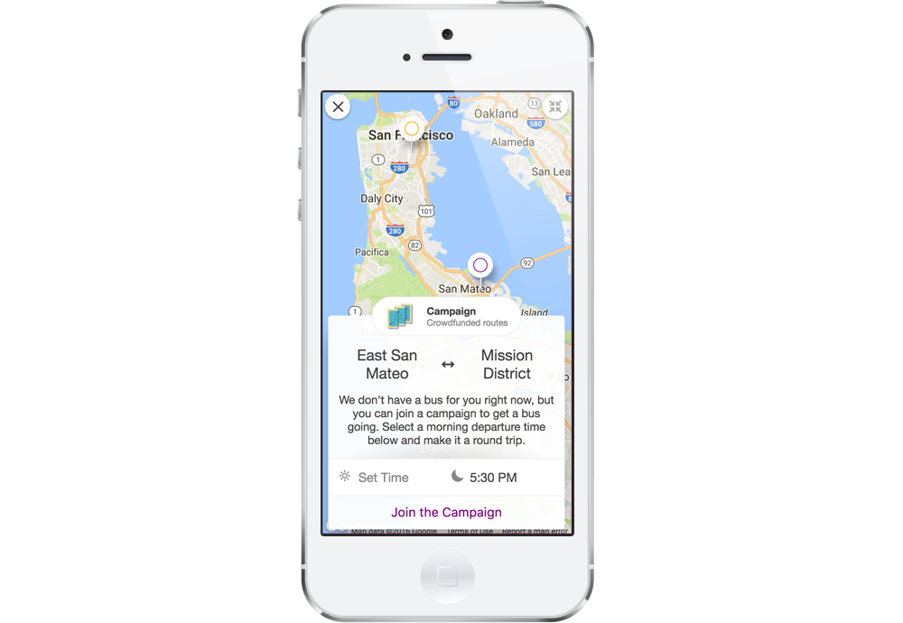
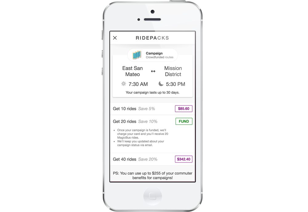
Once the campaigns were generally well-understood, and we had evidence that people were willing to put money down for a route, I started building Campaigns with React. I had to balance UX and technical constraints carefully, ensuring that our API could support campaign functionalities, and scoping the project in as many ways as possible. For example, handling multiple campaigns quickly became a hairy task in terms of both visual presentation and business logic. Although multiple campaigns will definitely be necessary in the future, version one of Campaigns only allows for one campaign at a time. Another interesting challenge was the geography of campaigns. Users submit their specific start and end locations, but campaigns intelligently abstract to the neighborhood with reverse-geocoding. This helps reflect the collaborative spirit of campaigns.
refinements
As MagicBus begins to broaden its product offerings, it's increasingly likely that people will be exposed to different products that have similar interfaces. After all, trips have many fundamental similarities. In order to help differentiate each product, I developed a series of product headers that include the product name, a short description, and a colorful icon. This will help people maintain context in the app, and alert them if they stumble upon a novel product.
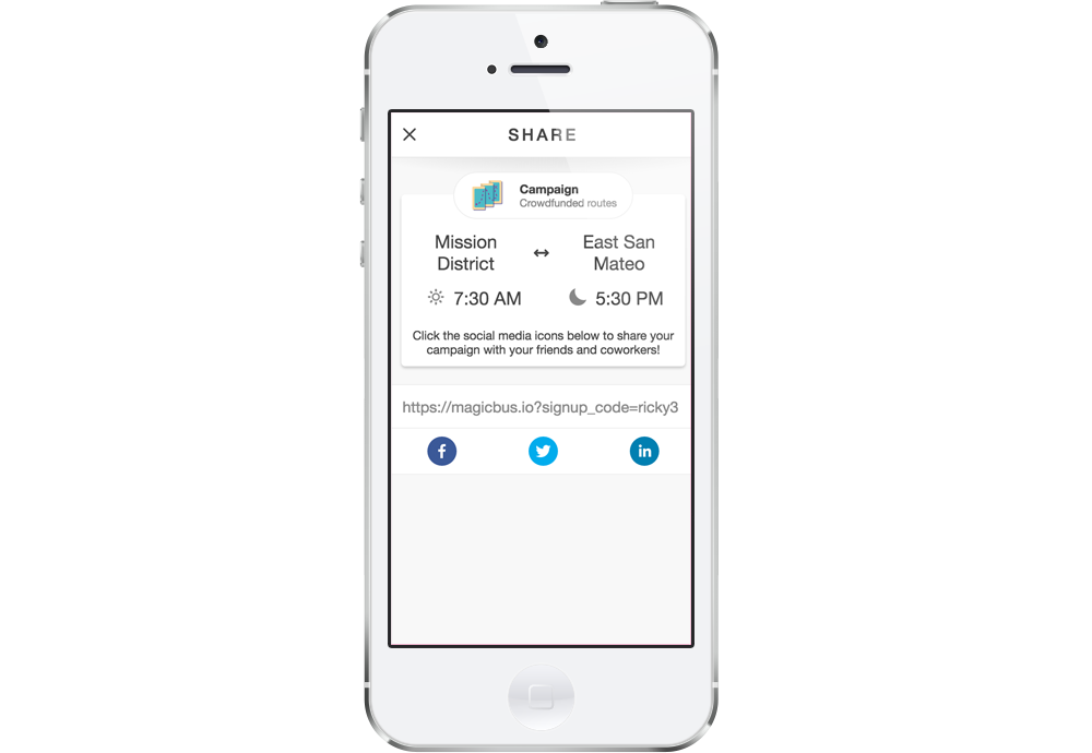
I also expanded sharing functionality so that people could post about their campaign on Facebook, LinkedIn, or Twitter. This helps spread campaigns through word-of-mouth. Additionally, the social media links and the associated sharing page are aware of campaigns and will change their content accordingly. I also used this as an opportunity to refresh the MagicBus social media brand by making some simple OpenGraph illustrations.
Reflection
Up 'til this point, I've designed many of my interfaces from scratch. MagicBus Campaigns were interesting, because they existed in the context of a broader product. This guided a surprising amount of my design and development processes. I started reusing key app components to create consistent patterns for users and reduce development overhead. Small touches like social media icons, or shifting from the booking flow to the campaign component make a huge difference in the overall user experience.
MagicBus Campaigns are also the first feature that I've had control over from inception to launch - and, if I learned anything, it's that launching can take a long time! Most importantly, I had to think on my feet during the entire design process. In the face of so many unknowns, there wasn't always clear data pushing us toward one decision or another. Instead, I needed to fall back on core usability principles, competitive analysis, and good old-fashioned hunches. Instead of trying to build the perfect campaigns the first time around, I focused on making smart guesses, and leaving my design flexible enough to accommodate changes in the future.
Additional projects
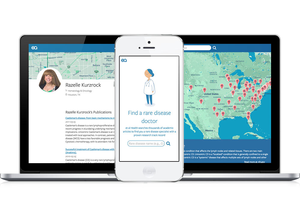
et al. Health
et al. Health uses peer-reviewed medical journals to connect patients who have rare diseases with a physicians who can treat them. read more... about et all health