et al. Health
- deliverable:
- web application and presentation
- role:
- product designer and front-end developer
- methods:
- user interviews. paper prototyping. usability testing. sketch. continuous integration.
- artifacts:
- project page, project proposal
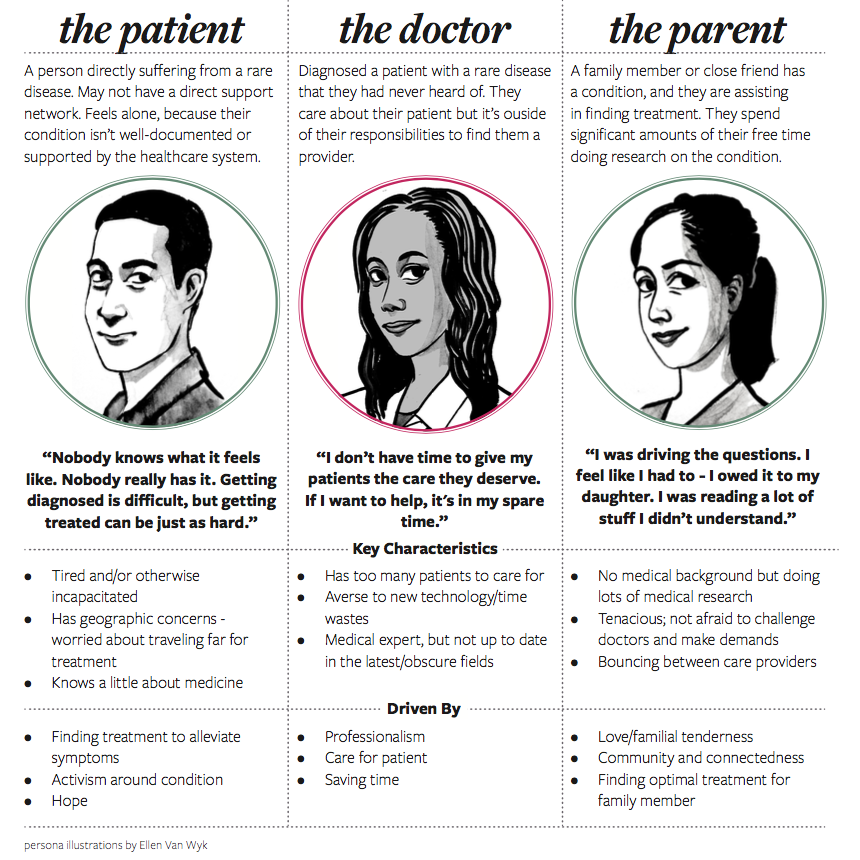
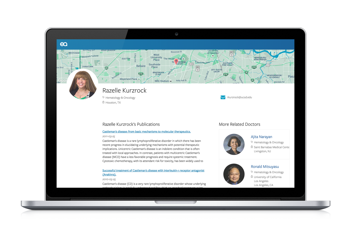
Problem
For most people, a trip to the doctor is just a part of their routine - and even when it’s an emergency, they can feel confident that their doctor will have some way to treat whatever is ailing them. However things become all but routine when a patient is diagnosed with a rare condition. In many cases, the diagnosing physician is not capable of providing treatment, and patients have to start a difficult journey to find a specialist that understands the nuance of the condition and state of the art in treating it effectively.
My team was appalled by this high barrier to finding treatment. Although this process is aligned with the National Institutes of Health’s recommendation for patients diagnosed with a rare condition, it is extremely labor intensive and requires highly specialized knowledge.
et al. Health
knowing our space
My team included two data scientists and one other designer. We worked alongside Marti Hearst, a professor at the Berkeley I School, Maryam Ziaie, co-founder and CEO of iSono Health, and the Castleman Disease Collaborative Network. They helped us with our product implementation, our business model, and subject matter expertise, respectively. Additionally, we conducted 18 interviews and analyzed 9 competitors in the healthcare space in order to develop our solution.
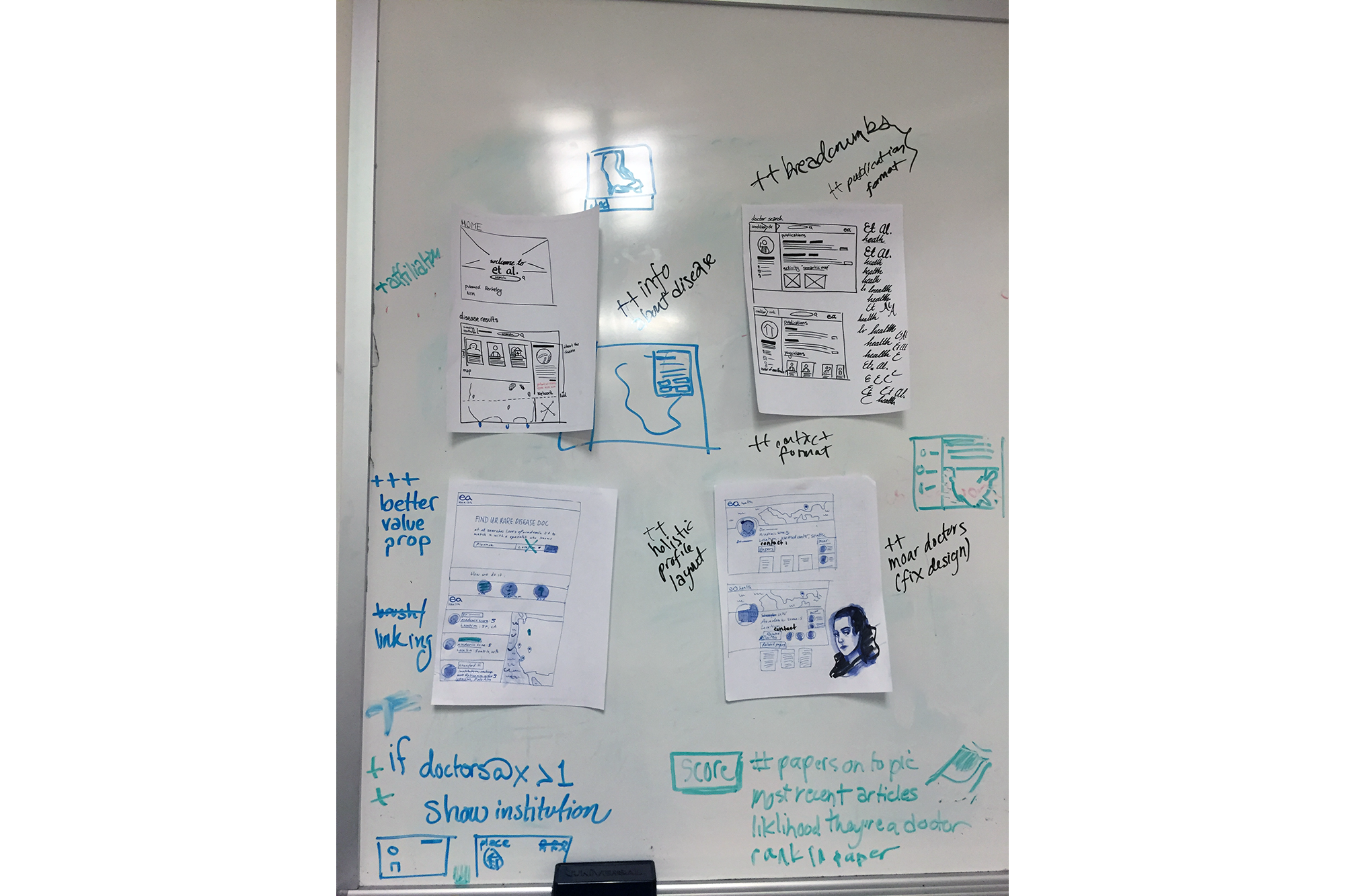
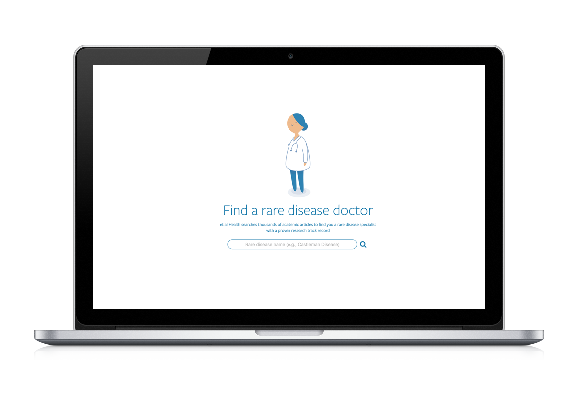
Early in our design process, we accepted that we were building a search engine. Basic search patterns already exist, so we didn't need to reinvent the wheel. Instead, we decided to define clear principles that could guide the search experience in et al. Health. They were: honesty, trust, inclusiveness, and uniqueness.
honesty
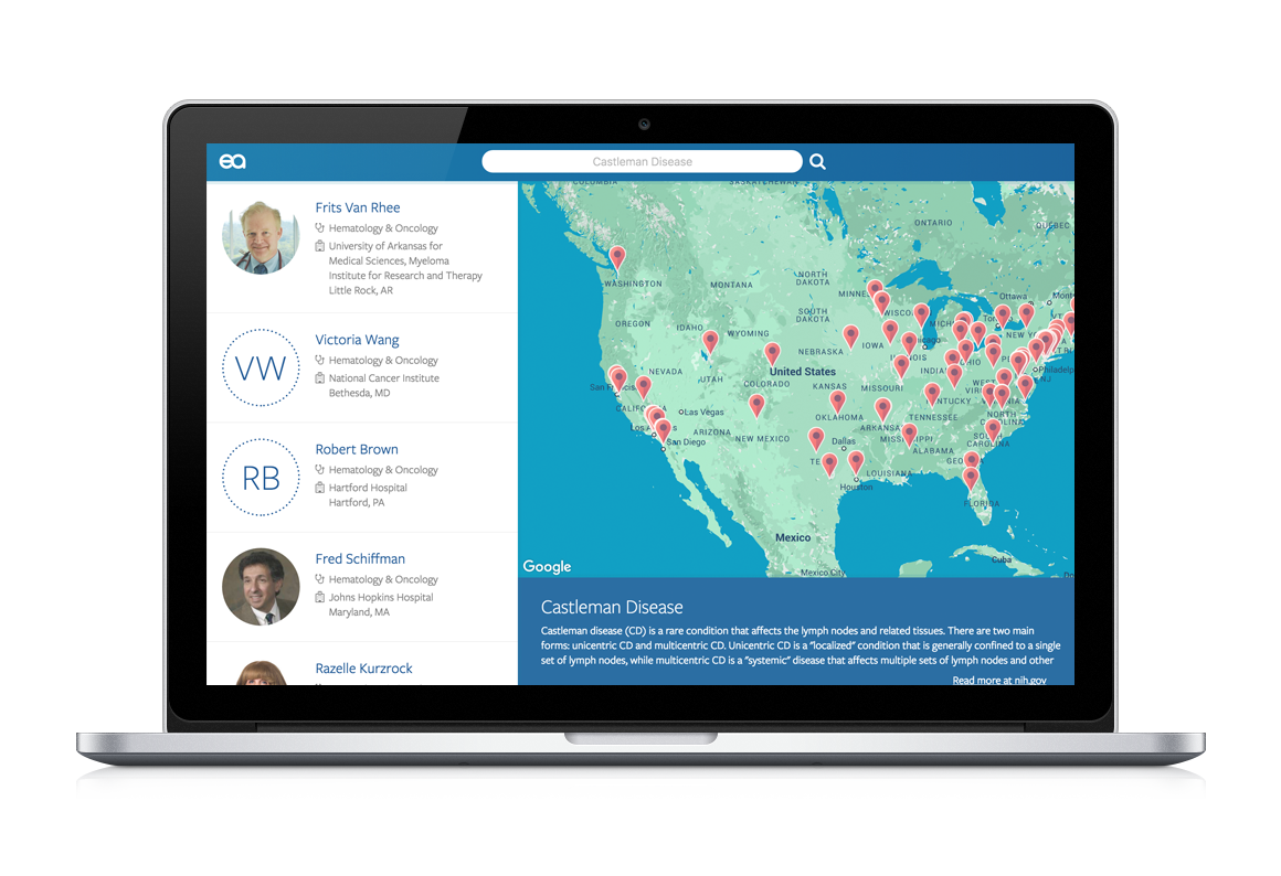
Sometimes, these principles helped us define a realistic scope. Good usability practice suggests including a rating system in order to help people sort through results. We considered implementing a metric of a doctor's research record quality. Once we started doing usability tests, however, we found that it was way too easy to misinterpret ratings. Generally, people thought that the rating system was an assessment of overall doctor quality, or user-submitted reviews. We tried to confront this by switching from stars to circles, and it still didn't work! In the end, to keep the interface honest, we got rid of the rating system. After all, what does an objective metric look like, anyway? For example, a high quantity of articles could be good, because it means they're knowledgeable about the disease — but, to others, it might be bad, because maybe that research record indicates that the doctor doesn't spend much time with patients. We didn't have the time or resources to tackle this complicated problem, so instead, we exposed article abstracts and linked to the full text so that people could develop their own understanding.
trustworthiness
We felt like medical journal articles provide useful context and add to the professionalism of our site. Yet, patients and families didn't really understand them. When they saw complicated titles, like, "HHV-8+, EBV+ multicentric plasmablastic microlymphoma in an HIV+ man", they were understandably confused. And yet, they really trusted the articles, and assumed that they meant the doctor "knew what they were talking about." As designers, this gave us a lot of power. Fortunately, peer-review is a useful proxy for quality, but moving forward, we want to consider our data pipeline more carefully. We want to make sure that we're handling our users' trust responsibly.
inclusiveness
We spoke to many people with rare diseases who expressed feelings of being excluded. After all, most healthcare sites cater to people with more common diseases. We wanted to make sure that we designed a site that was as inclusive as possible. First of all, we made sure that our site accommodated as wide a range of ages and access needs. et al. Health is AA accessible, and navigable with a screen reader. Furthermore, we considered medical knowledge to be an important facet of accessibility, and so we used the principle of progressive exposure to help expose granular information to experts without overwhelming novices. First, a person sees a doctor, then an overview of their research and location information, and finally, they can view the full article on PubMed. Finally, et al. Health is fully responsive and autoprefixed to accommodate as many browsers and contexts as possible.
uniqueness
Little details helped us differentiate et al. Health. For example, doctor photos were a little bit of extra effort on our part, since there's not a formalized repository of physician photos. We were also concerned that photos might introduce bias into the decision-making process. In the end, however, one research participant mentioned that, "photos give you a little more certainty in a very uncertain process." There are very few 'knowns' when you have a rare disease — so, when you walk into a doctor's office, it's nice to know exactly who you're looking for. We also exposed information like disease subtypes, and patient resource groups in our interface. All of this helped users hone in on the right treatment, as well as support tailored to their conditions. Again, this required a little more manual labor on our part, but if it means that patients get the care they deserve, it's worth it!
Reflection
We conducted 2 photo elicitations, and about 8 usability tests - and by the end of the semester, people were completing all of our key tasks, and responding positively to our brand. Additionally, over the course of the project, our team had to negotiate and make trade-offs regarding user needs and the capabilities of the data we had.
We also found that our interface and the underlying data often informed each other; our interface helped the data team quickly understand where things were going wrong, and having access to real data helped us create an interface that was visually and technically durable. We included empty states, accounted for varying photo sizes, and developed strategies for accommodating heterogenous content. And, in the end, it paid off: we won third place out of around 250 entries in the UC Berkeley Big Ideas contest, and we won the James R. Chen Award in our final project category at the UC Berkeley School of Information!
Additional projects
dance dance
Our team designed and built a sweater that uses accelerometers to interpret dancing and display the motion using LED strips on the sweater sleeves. read more... about dance dance, a sweater that lights up while you dance.