Employee Community
- deliverable:
- interactive prototype and research report
- role:
- product designer
- methods:
- user interviews. affinity diagramming. paper prototyping. sketching exercises. sketch. keynote interactive prototype.
- artifacts:
- available on request
Problem
During my internship at Salesforce, I was working with another I School student and thinking about the problem of employee intranets. We’d used intranets before, but we hadn’t give them a ton of thought. So, we went ahead and did some competitive analysis and user interviewing to figure out our problem space. The results were ultimately that:
- Intranets often contain static content that's only from stakeholders.
- The intranet exists outside of people’s workflow — they have to break from their tasks and go to it.
- People have different levels of organizational knowledge, so new employees need a different workflow than more established employees.
Employee Community
experimenting with process
My partner and I actually started off by toying with design sprints in an attempt to be completely agile. To be honest, though, this blew up in our faces; since we didn't really have an existing product to work with, it was nearly impossible to scope our sprints well. It also had a strange effect of causing us to lose touch with stakeholders since the day-to-day was so demanding (and others couldn't join us in the sprints.) We quickly pivoted from our sprints, moving into a more traditional iterative design cycle.
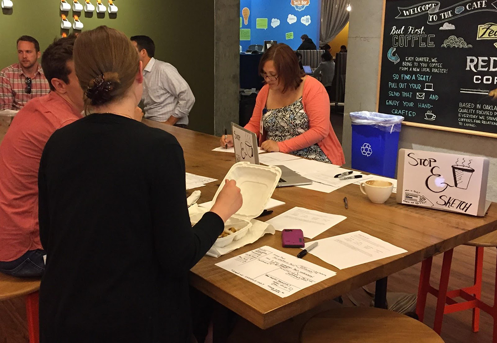
We still wanted to toy with methods, though. So, rather than making assumptions about the interface, we went out into the company and asked people to do sketching exercises with us. This was incredibly useful as both design and research. It offered us a glimpse into people's mental models for an intranet, and it also helped generate lots of new ideas before we started to converge.
design choices
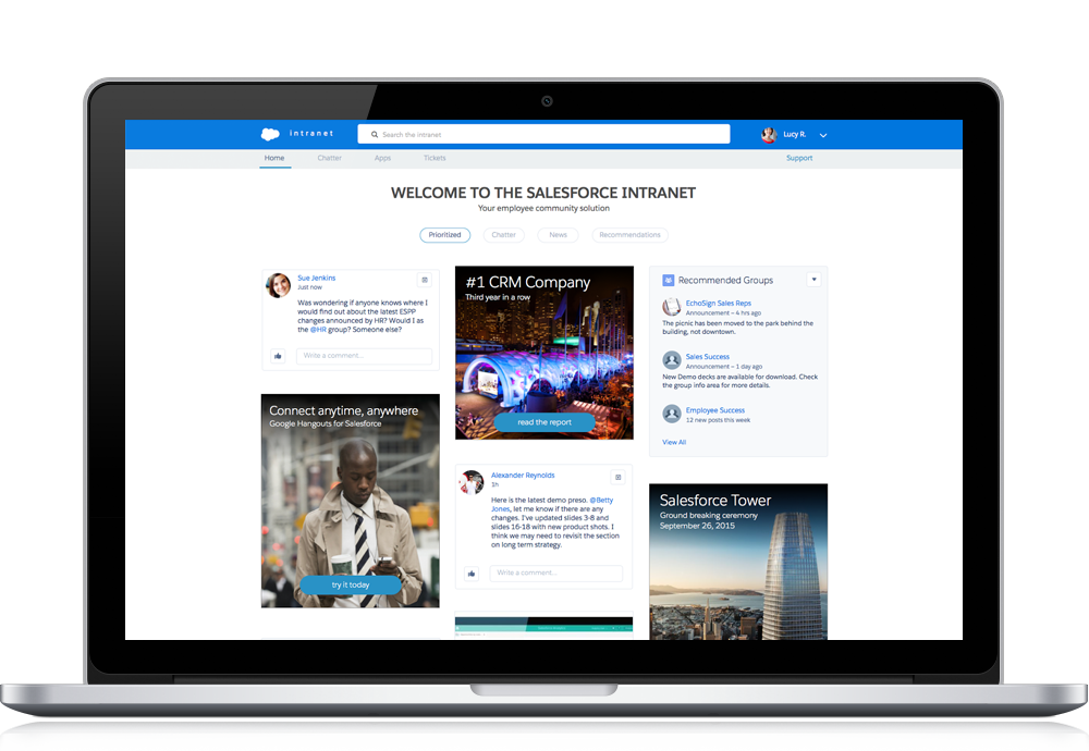
Eventually we did converge. We ended up using the masonry-inspired feed as our final design, since it allowed for a healthy mix of different content. This meant that we could include top-down information (e.g., an announcement from the CEO) alongside bottom-up information, like a quick update from a coworker. We were also able to slip in key tasks and discovery, and then skew those discovery interactions towards new users to help them onboard to the company.
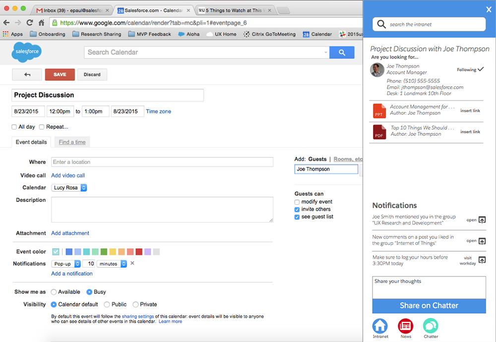
One of the major problems our users faced was the intranet being siloed. So, we also prototyped a browser plugin that could respond to the various pieces of information on a page. For example, if you're sending an email to somebody, it'd be great if you could just highlight their name, press a hotkey, and then get more information about their role and projects. The opportunities for these contextual interactions are endless, so it helps turn the intranet into a platform, rather than a database.
Reflection
In the classroom and my own time, I can do my design work for myself — my only real constraint is my own ability. Designing the employee community project was a great opportunity to work for real stakeholders with an investment in the product at hand. This can be difficult. When you're responding to a design manager, a product manager, an engineering team, AND users, you're bound to come up with some conflicting directions. At the end of the day, however, I realized that I just need to design like I'm right, using my research to clearly articulate why what I'm building solves a real problem and creates real value.
Additional projects
magicbus campaigns
MagicBus needed a way to open new routes with confidence. Campaigns help commuters provide a stronger signal that they're ready to ride read more... about magicbus campaigns