aesthetic notes
- deliverable:
- high-fidelity prototype
- role:
- visual design
- methods:
- aesthetic research, compositional studies, sketching, wireframing, prototyping
- artifacts:
- process document
Problem
I adopted Evernote in January 2015 and the web clipping feature changed my life. I love saving all of my content being able to search across it easily. I noticed, however, that Evernote’s interface relies on the text of clipped articles, despite the beautiful and distinctive images within them. This is totally appropriate, but I wanted to explore the use of imagery as an interface for collections. What happens when we take a text-based interface and reimagine it to prioritize images?
aesthetic notes
getting started
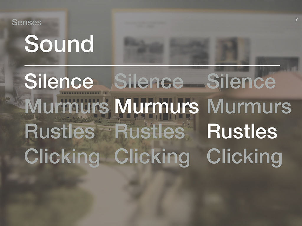
Rather than starting with user interviews, I went out into the world and explored reflective spaces like libraries and the shower. In the library, I observed quietness, guilt, and muted colors - and similarly, the shower in my apartment was a bleak, if reflective place. Knowing this, I created personas to establish a workflow and key screens for the type of people who would want to save articles — namely, a professor, a student, and a person who’s collecting recipes. I also did competitive analysis to explore how other designers handled these “container” interfaces that needed to handle dynamic and/or variable content.
making it happen
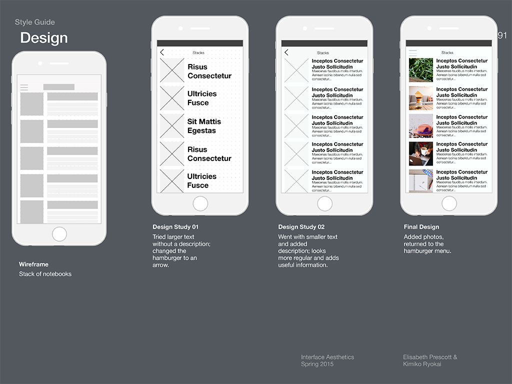
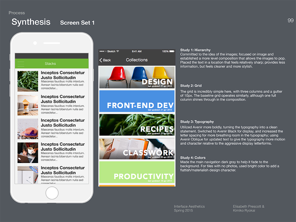
Once all of that groundwork was done, I went to wireframes and worked my way up to high fidelity mock-ups using Photoshop and Sketch. Eventually, I ended up breaking away from the quietness and reflection, and instead made a vibrant, visually striking interface. It uses bold color to create visual interest, and large typographic forms that feel like images while still remaining semantic.
Reflection
Having had the majority of my training in user-centered design, the shift to a more visual approach to UI design felt pretty awkward. Yet, wrestling with the composition, color, and typography helps draw the connection between the two: a careful eye toward aesthetics can go a long way to creating a usable and delightful experience.
It’s easy to dismiss aesthetics as subjective or extraneous — and, to be certain, in some cases the visual design is just for flair. In the vast majority of cases, however, the visual design of the interface is key for accessibility, navigability, and understandability. By thinking careful about the elements of graphic design, I can prevent people from getting distracted by confusing design choices and direct attention using visual tension to draw the eye.
Additional projects
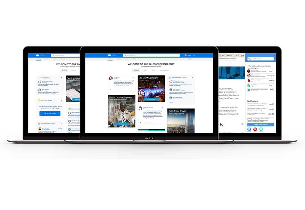
employee community
Sharing knowledge across an organization using siloed, web 2.0 intranets is hard. I designed a contextual employee community to help solve the problem. read more... about the salesforce employee community design project