nickvision
- deliverable:
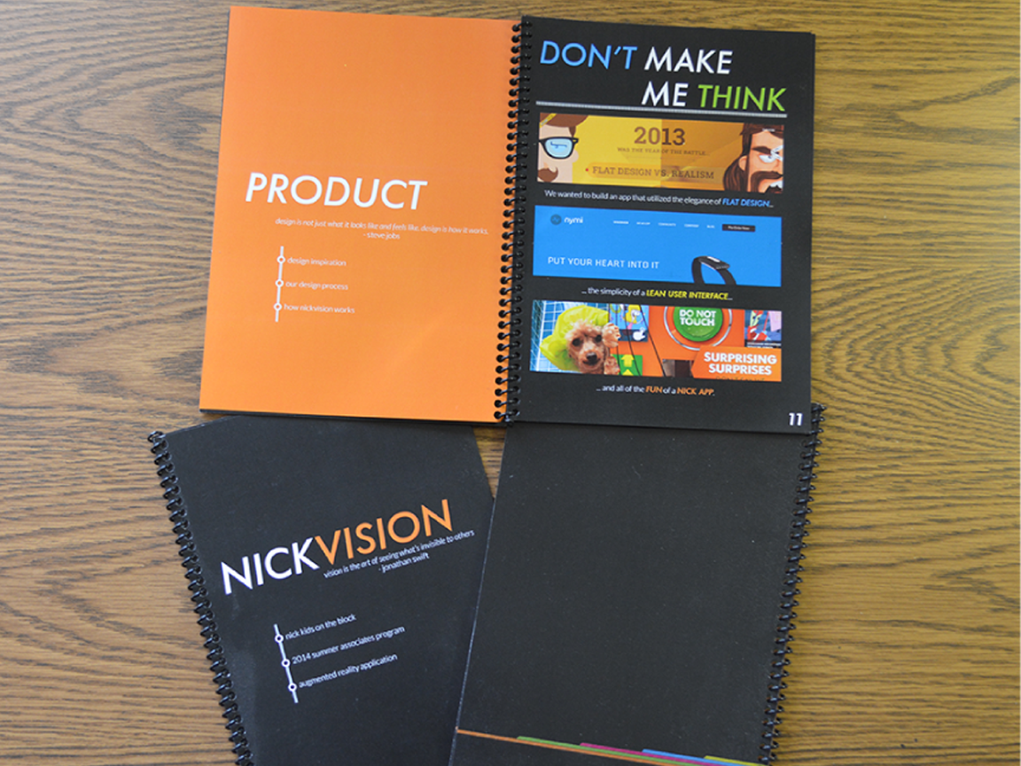
- process book & interactive prototype
- role:
- graphic design & ux design
- methods:
- conversation mapping, whiteboarding, sketching, round table brainstorming, business & marketing strategy development
- artifacts:
- process book, slideshow deck (pdf, no animations)
Problem
I was working as one of ten summer associate for Viacom, focusing on the Nickelodeon brand. As a summer associate, you’re expected to work as a full time employee - and I was working in Digital Analytics for apps and games. The summer’s real challenge, however, involves building an app that creates value for one of the Viacom properties. I teamed up with four other summer associates, and together we started asking ourselves: what cool product would add value to the overall Nickelodeon brand?
nickvision

ideation
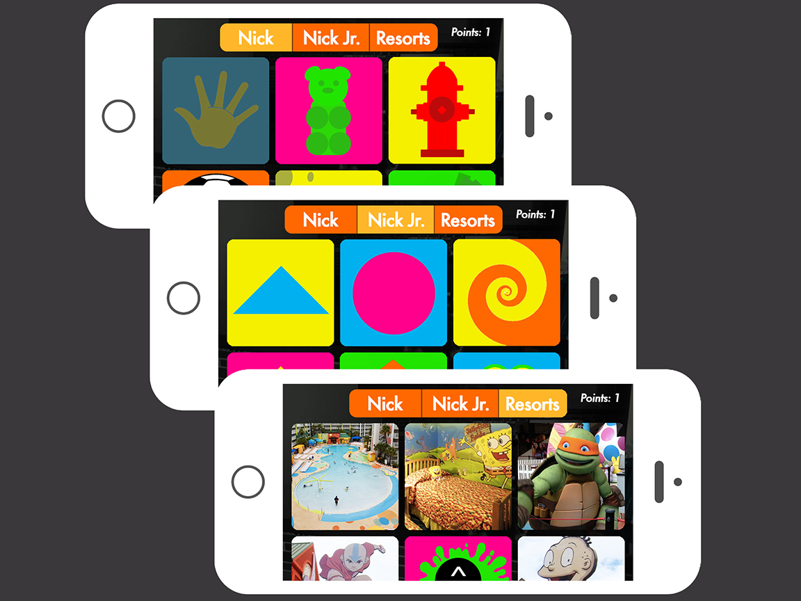
My team started out with some divergent thinking exercises to answer our questions about the Nick brand. We each came up with a pitch for the brand, and then we came back together to figure out what felt compelling and feasible in 8 weeks. We eventually came up with Nickvision, an augmented reality app for the Nickelodeon brand. Then, we split it into four main components: research, product design, marketing, and business strategy.

On the research side, we did competitive analysis to show how other companies were using augmented reality, and some usability testing to vet our concept. We also developed a holistic marketing strategy that involved integration with Nick Jr., as well as major Nickelodeon events. We also worked with representatives from the resorts to design integration with the Nickelodeon hotels and resort. Finally, we created a business strategy that allowed us to provide the app for free, while still monetizing (and abiding by COPPA regulations, of course!)

my role
I primarily worked on the user interface and user experience (product) of the system. This involved prototyping key screens and features for our pitch, which happened across multiple fidelities — for example, we did a version of our interface that was just a conversation script to simplify the flow of the interface. I also designed the booklet linked above. Finally, our team, Nick Kids on the Block, presented our work to a full house of managers, directors, and executives from across Viacom (including the CFO!)
Reflection
Building Nickvision was a challenging process. As a team member, I needed to collaborate with really smart people with very different backgrounds. It was an incredible opportunity to learn from different perspectives, since our actual roles and backgrounds were really different. As a designer, however, I learned a lot about working within a brand. My own opinions about design had to fade away so that I could accommodate a property that was much larger than myself. Perhaps most importantly, Nickvision was my first experience taking ownership of a product. In some ways, this was nerve-wracking — presenting to the CFO of a giant media corporation will do that to you — but it was also awesome to be trusted as an innovator so early in my career. Plus, whispers around the office suggest that people were pretty excited about Nickvision!
Additional projects

aesthetic notes
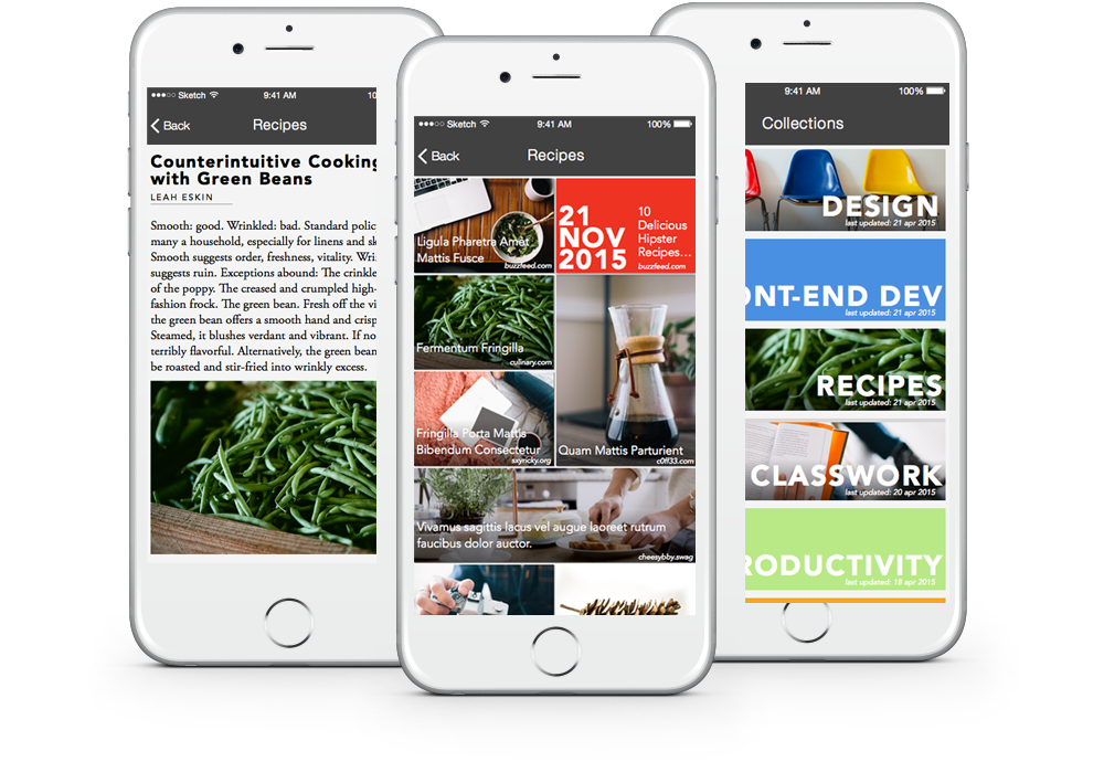
Reviewing notes is often a text-heavy experience. What might it look like if it were a little more visually oriented? read more... about the aesthetic note project